
Three simple recruiting-video tweaks that make your highlight link easier to watch and easier to evaluate on a phone.
Your highlight link has to be playable on a coach's phone
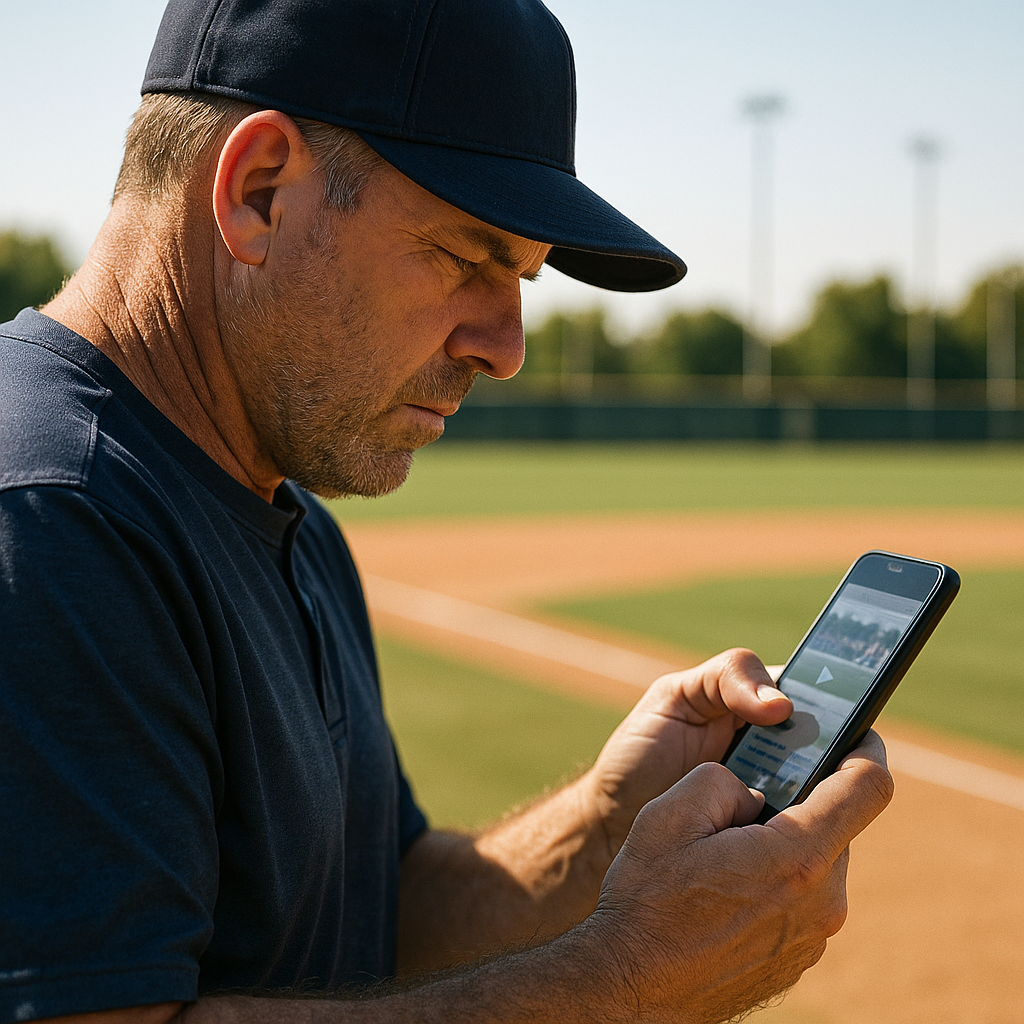
I learned this while watching a coach scroll through recruiting links between innings. He wasn't at a desk or wearing headphones, and he wasn't going to spend long fighting with a page that was hard to use. So when you build a digital portfolio showcase for recruiting, start by making sure the profile works well on a phone.
Here are the three checks I run before I send anything. First, open your highlight and your profile page in a private/incognito window on your phone, not on your laptop, where you're already signed in. If it asks you to download an app, request access, or accept cookies twice, that's friction. Keep the coach on one tap to play. Second, watch your own first 15 seconds with the sound off. Most coaches are in gyms, in cars, or in hallways. If your first clip needs audio to make sense, it doesn't count as a first clip. Third, make the text on your page do the work without forcing a pinch-zoom: your name, grad year, position, height/weight (if relevant for your sport), school, and a clean contact line. Put it at the very top.
A quick platform note from doing this across families and teams: YouTube is fine, but I prefer an unlisted Vimeo video for the main reel when possible because anyone with the link can watch without a Vimeo account. The important thing is that the link works without asking the coach to request access or sign in. Just make it play instantly, show the context (score/period or game situation in a small corner title card), and keep the rest of the page boring in the best way.
Put your recruiting materials in one place
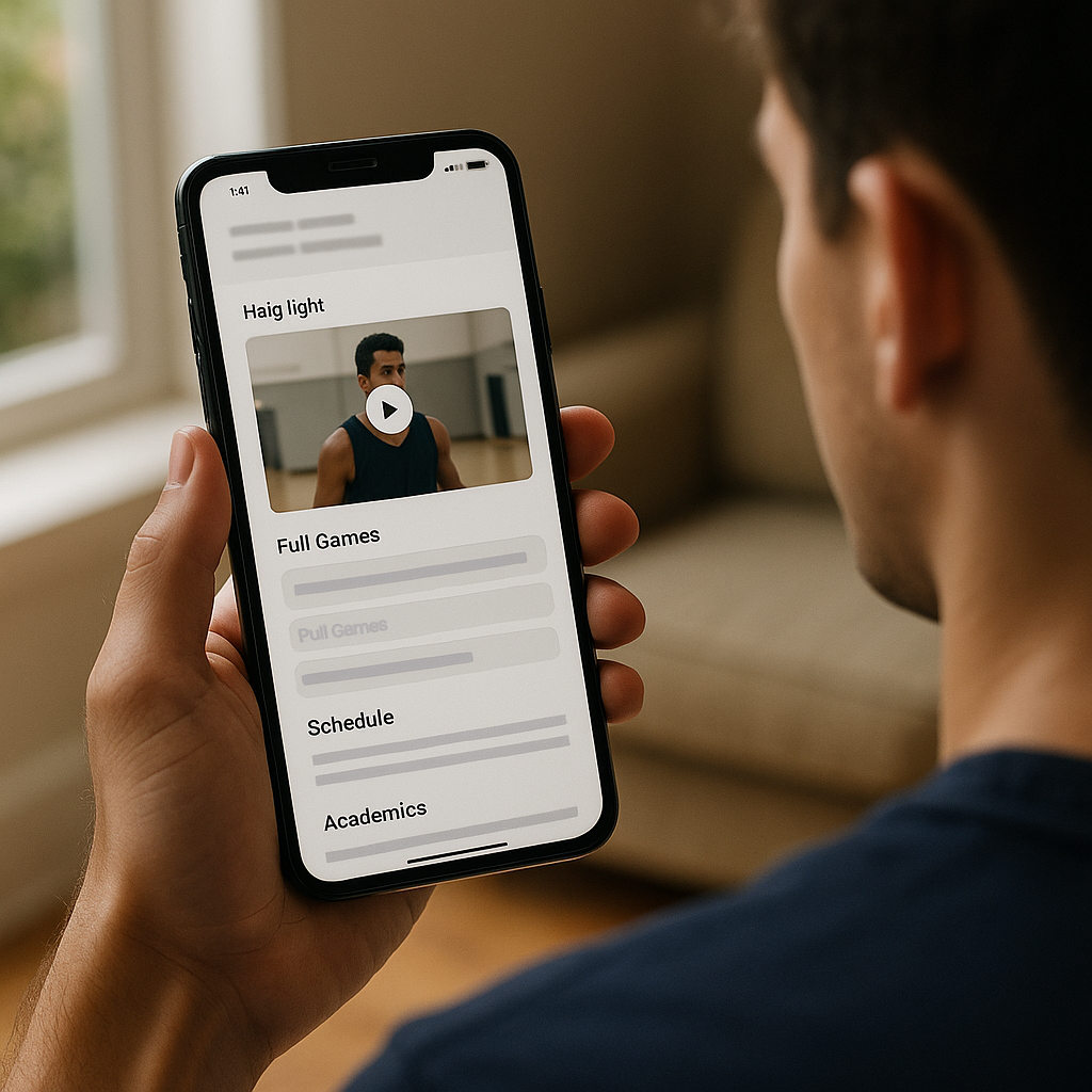
If you want your recruiting profile to stand out, give coaches a single landing page that feels like it was designed for them. I'm talking about a simple hub page: one URL that contains your highlight reel, two to four full-game links, a short schedule/results section, and the bare minimum documents.
My working template is basically: top section with contact info and a two-line summary, then your reel, then a section titled something like Full Games, then a section for measurables and academics. That's it. Use a platform that renders cleanly on mobile. A basic Google Site works, a Squarespace page works, and even a Notion page can work if you keep it tight and test it on a phone. The point is to make the information easy to find.
For full games, don't dump an entire season. Pick clips that match what you're asking for. If you're contacting a program that emphasizes fast transition play, include a game that shows how you handle that style. If you're a pitcher, one start where you had to get outs with runners on. Then label each game link with opponent, date, and your jersey number right in the text next to the link. Coaches shouldn't have to guess who you are at 1:12:43.
Also, check the sharing permissions before you send the link. If you use Google Drive, set the sharing setting to "Anyone with the link can view," then test from an account that's not yours. If you use Hudl, check the video's sharing settings and test the link while logged out before you send it. A login requirement can add an unnecessary step between the coach and the video.
What coaches want in timestamps (and what they skip)
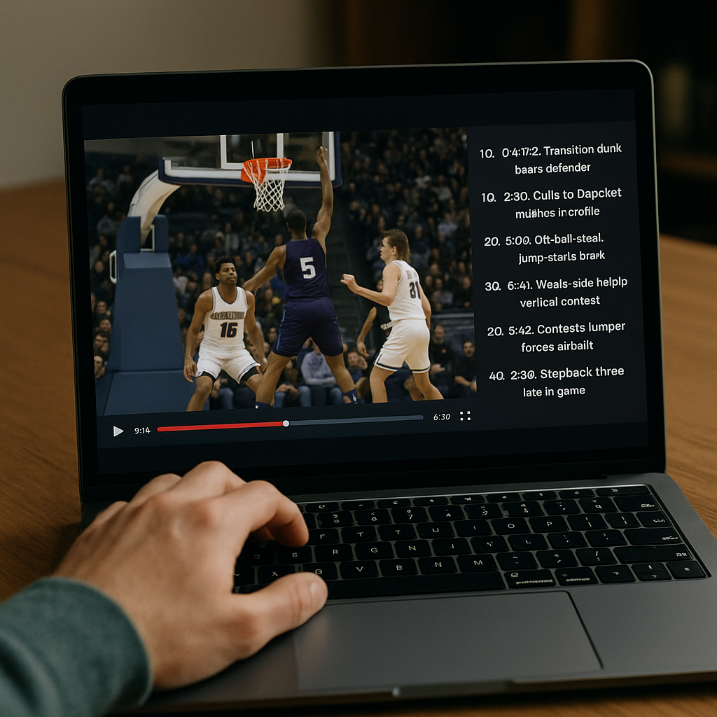
Timestamps can make full-game footage easier for a coach to evaluate without adding any new footage. A common mistake is either leaving out timestamps or adding a long list that says nothing: 0:12, 0:24, 0:41. A list of timestamps without context doesn't tell the coach what to look for.
Pick 8 to 12 moments in your full-game links and write one short scouting note for each. Examples that I've seen get replayed: "3Q 6:14: weak-side help, arrives on time, vertical hands" or "Top 5, 1 out, runner on 2nd: first-pitch strike, stays aggressive" or "2nd set 18-18: serve receive, stays calm, perfect pass." The format matters less than the information. Situation plus your action plus what it shows. If you're in a sport where the broadcast angle is rough, add the jersey color and number to the timestamp line so there's no hunting.
There are two things that can make full-game footage harder to evaluate: (1) five straight clips that are all the same outcome, like five open-field tackles with no context, and (2) anything that looks filtered or over-edited. Keep your cuts clean. If you need a circle, use it once at the beginning of the play and then let it go. If you stack effects on top of effects, it starts to feel like you're hiding something even when you're not.