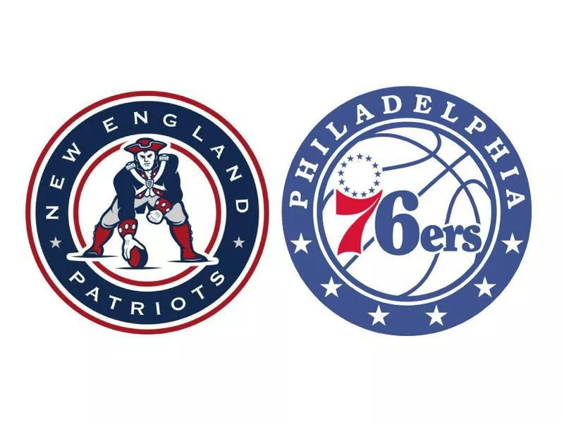
×
Home PageHigh SchoolBaseballBasketballFootballSports ExtrasAbout UsTerms of ServicePrivacy PolicyAdvertiseContact UsDo Not Sell My Personal InfoAlways PetsBig EditionFamilyMindedFar & WideStadium TalkWork + Money
© 2024 Big Edition, Inc.
Extras

Pro Sports Logos That Best Represent Their City

Major professional sports teams can do a lot for their cities: provide entertainment, generate revenue, unite the people. The best teams also educate. 

The New Orleans Jazz and the Minneapolis Lakers revealed a lot about where they’re from, before they moved away.

NFL teams have bird logos, but few of them sum up their fan base or location all that well. The history of actual vikings in Minnesota is suspect at best, and their colors and logo are more West Coast than Midwest.

And if the Toronto Raptors were called the “Rappers,” they might be part of this discussion.

You can learn a lot about a community and its history from pro sports logos. These teams represent their hometowns best.

Pittsburgh Steelers

Pittsburgh Steelers logo

The most representative logo of Pittsburgh’s “steel city” is the Pittsburgh Steelers football team. Originally named the Pirates, owner Art Rooney agreed to change the name to “Steelers” in 1940 to better reflect the city’s primary source of employment.

The final 1963 Steelers logo fans know today comes from the the “Steelmark” logo, originally developed for U.S. Steel and now a trademark of the American Iron and Steel Institute. It came to represent the three materials used to produce steel: yellow for coal, orange for iron ore, and blue for steel scrap.

Pittsburgh is Pennsylvania’s second-largest city and lies on the western side of the state, opposite Philadelphia. The city’s commerce boomed after the American Revolution, largely because the intersection of three rivers served markets in surrounding states. Three Rivers Stadium, where the Steelers played from 1970 to 2000, reminded residents of that geographic significance.

At its peak, Pittsburgh had more than 300 steel-related businesses and still holds more than 400 steel bridges. It’s the place where the underdog son of an immigrant, Andrew Carnegie, made and gave away his fortune. And if that doesn’t convince you of Pittsburgh’s scrappiness, western Pennsylvania also hosted the Whiskey Rebellion and was home to many significant Underground Railroad stops.

Long before Wiz Khalifa rapped about the “Black and Yellow,” journalist Herbert N. Casson wrote in his book, “The Romance of Steel,” that “Pittsburgh is more than a city.” It is “the acme of activity … an industrial cyclone,” a region of “sweat and gold.”

Minnesota Twins

Another team logo that reminds fans about the development of cities along rivers is the Minnesota Twins. The “Twin Cities” area refers to the two largest cities in Minnesota, Minneapolis and St. Paul, which are less than 10 miles apart and connected by the Mississippi River.

Minneapolis, also known as “The Mill City,” developed near the only natural major waterfall on the Upper Mississippi River, a water source that provided power for sawmills and flour mills. General Mills and Pillsbury started there, for instance.

Saint Paul, the capital of Minnesota, developed because of an early U.S. military fort at the confluence of the Mississippi and Minnesota Rivers that sought to establish American dominance over the fur-trading industry on the water.

Even though these two close cities compete for resources, the Twins logo embodies the spirit of “Minnesota Nice,” a polite friendliness and an aversion to confrontation.

New Orleans Saints

At the other end of the Mississippi River lies the Creole city of New Orleans, which was founded by the French, ceded to Spain, acquired by the U.S. through the Louisiana Purchase, and now is home to anyone who’s not ashamed to have a good time.

Its NFL team, named the Saints because many citizens have Catholic roots, started in 1966 on “All Saints’ Day.” The Saints’ logo, the iconic fleur-de-lis, is a French-inspired, stylized lily flower with three petals bound together near the base. Although it could be considered a symbol of colonialism, New Orleans fans now see it as a symbol of unity for “Who Dat” Nation.

Fans often sing “When the Saints Go Marching In,” and second line brass bands play it on the streets on game day to celebrate the team.

Colorado Rockies

Sticking with the geography theme, look no further than the Colorado Rockies, a rare example of a modern Major League Baseball expansion team that actually chose a representative name.

Maybe it’s because they started playing in Mile High Stadium, but even their current Coors Field incorporates fresh-brewed marketing “in the Rocky Mountain tradition.” The purple color in their logo and uniforms comes from the lyrics “for purple mountain majesties” in Katherine Lee Bates’ well-known “America the Beautiful” song.

The Rocky Mountains are a major mountain range, towering through the majority of the western United States and Canada, and form the Continental Divide, which separates rivers draining into each ocean. Much of the Rockies are protected through public parks and forest lands, providing space to hike, camp, fish, hunt, bike, ski and snowboard.

What’s more Colorado (and American) than that?