New Minor League Alternate Identities Unveiled for the 2026 Season
Minor League Baseball keeps finding new ways to entertain fans before the first pitch is even thrown. For the 2026 season, teams across the country are rolling out fresh alternate looks tied to specific places, histories, traditions, and inside jokes. These concepts are worn for select games and come with custom logos, uniforms, and merchandise that often become instant collector favorites.
It is also worth noting that alternates are not always tied strictly to a team’s current city. Some reference former franchise homes, regional folklore, historic milestones, or cultural symbols that extend beyond municipal borders. Below is a rundown of every new alternate announced so far for 2026, along with the place, era, or idea each one represents.
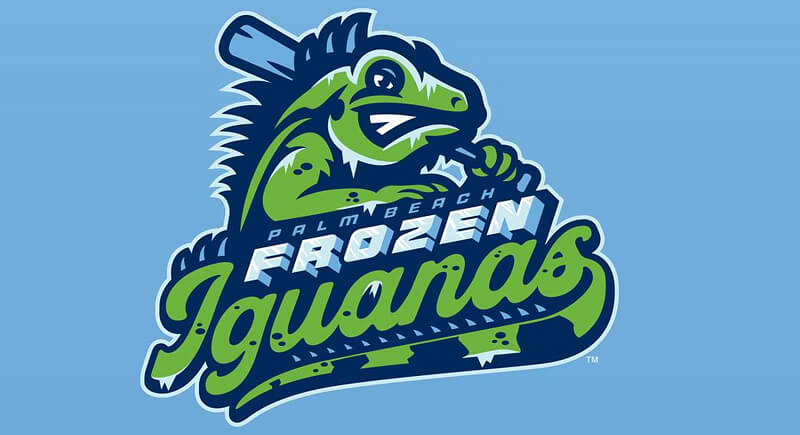
Palm Beach Frozen Iguanas
Credit: Facebook
Cold snaps into the low 40s°F are rare in South Florida, but when they happen, iguanas can temporarily freeze and fall from trees, a real phenomenon locals know well. This alternate leans fully into that regional quirk. The Frozen Iguanas will appear during 12 Saturday home games, using icy blue tones and falling iguana imagery to exaggerate a moment that is uniquely Floridian.
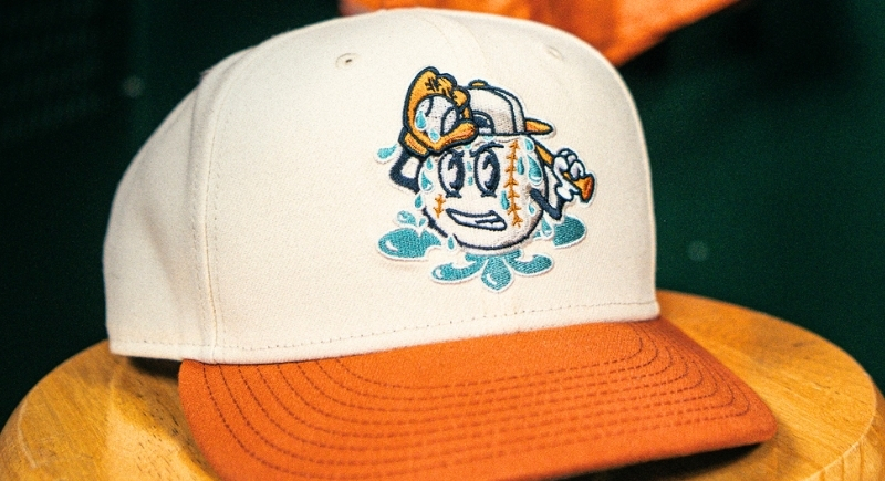
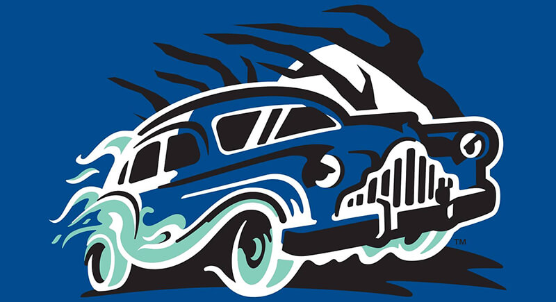
Louisville Humidity
Credit: Instagram
Summer in Louisville often brings oppressive air and constant sweat, and that shared experience is the entire joke here. Rather than referencing a mascot or historical figure, the concept focuses on climate. The logo features a baseball character dripping with moisture, with puddles forming beneath it. Jerseys even feature printed sweat marks.
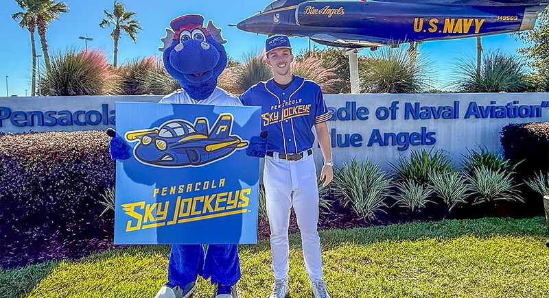
Pensacola Sky Jockeys
Credit: Facebook
Aviation history drives this concept from top to bottom. Pensacola is known as the Cradle of Naval Aviation, and military jets routinely fly overhead during games. This look pulls directly from that legacy, with an anthropomorphic fighter jet logo, sharp angles, and lettering inspired by squadron markings rather than traditional sports fonts.
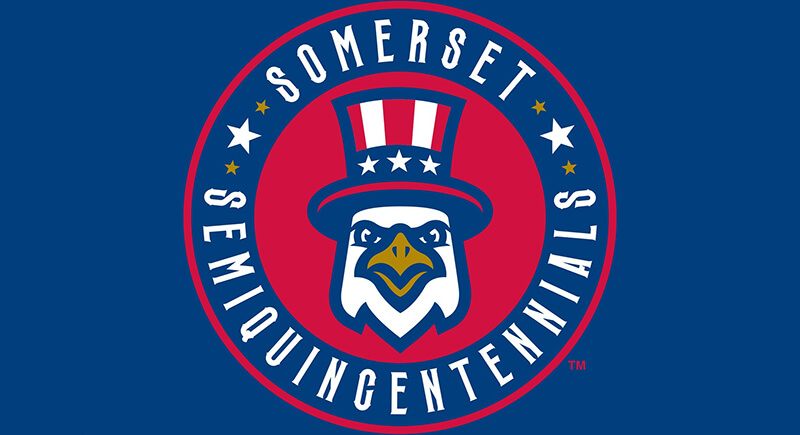
Somerset Semiquincentennials
Credit: Facebook
The year 2026 marks the 250th anniversary of the United States, and Somerset leaned fully into that milestone. This is one of the few alternatives built around a specific historical moment. Used for four games, the name clocks in at 19 letters and features Revolutionary-era imagery that aligns naturally with the Patriots brand. Central New Jersey’s role in the Revolutionary War gives the concept a deeper footing than a simple anniversary tie-in.
Carolina Reapers
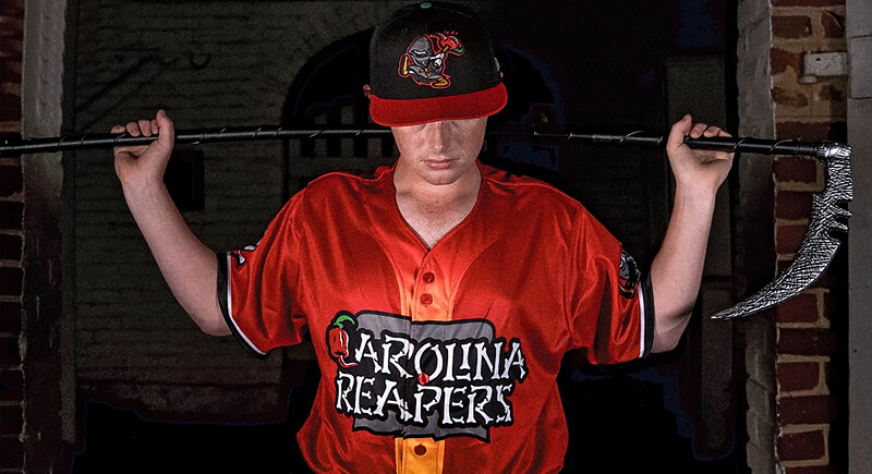
Credit: Instagram
Heat is the point, and subtlety is not part of the plan. The Carolina Reaper pepper, developed in South Carolina by Ed Currie, regularly exceeds 2,200,000 Scoville heat units. The name references the broader Carolinas region rather than a specific city, while the logo emphasizes intensity with a hooded figure and a flaming pepper. Uniform details nod to the Scoville scale and the culture of extreme spice.
Art of the Woo
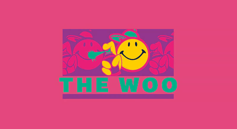
Credit: woosox
Rather than using a mascot, this look centers on typography and modern culture. Art of the Woo reflects Worcester’s street art, murals, and creative institutions through graffiti-style lettering and bold visual balance. Worcester also has historical ties to the original yellow smiley face design, which connects this look to other elements of the team’s branding.
Kelley Squares
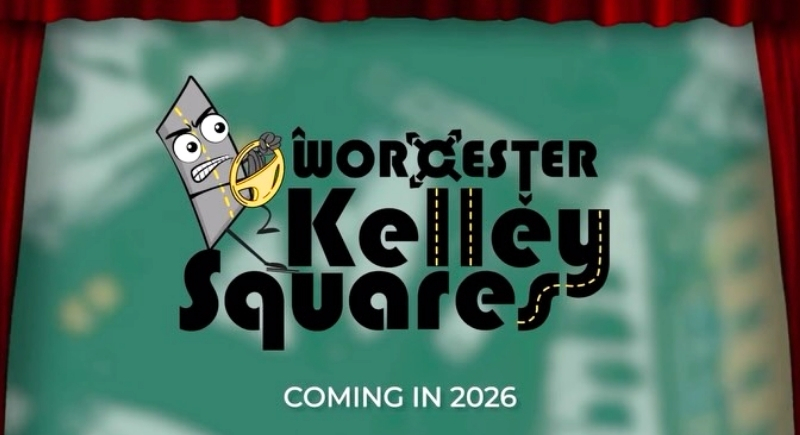
Credit: Instagram
Anyone who has driven through Kelley Square immediately understands the joke. The infamous intersection near Polar Park combines multiple roads in a confusing pattern that has frustrated drivers for decades. This concept turns that shared experience into a brand, featuring a stressed road character gripping a steering wheel, with dashed yellow lines incorporated into the lettering. It is firmly rooted in present-day Worcester life.
Pawtucket Hot Wieners
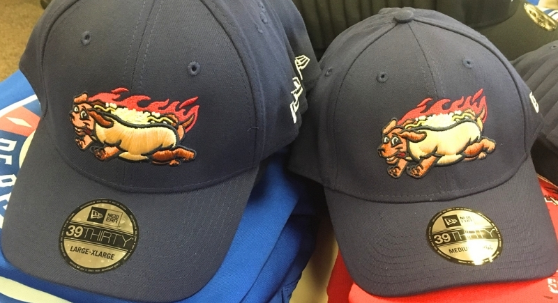
Credit: Facebook
This alternate reaches back into the franchise’s history. Before relocating to Worcester, the team played in Pawtucket, Rhode Island, where hot wieners topped with meat sauce, onions, and mustard are a local staple. Including this in a 2026 roundup serves as a deliberate nod to a previous era via a food locals still debate passionately.
Eerie Wearies
Credit: Facebook
Drawing from regional folklore, Eerie Wearies’s name comes from Weary Road in Evansville, Wisconsin, located about 25 miles from Beloit. It’s long associated with spooky stories and late-night rumors, and the legend provides the foundation for the cloaked figure and eerie visuals. The choice fits neatly into Minor League Baseball’s growing interest in folklore-based themes that resonate beyond a single town.